

There was no design team, no budget for a design system and no time to stop shipping. What we did have were four products slowly drifting apart, one screen at a time. Here’s how I built a design system on my own, and what I’d do differently next time.
- Products, one system
- 4
- Token layers
- 3
- Designer (me)
- 1
01 · Why bother
Nobody asked for a design system
I design for a healthcare SaaS platform: a customer mobile app, two dashboards for coaches and admins, and a web portal. When I joined, each one had grown up on its own. The colours were almost the same but not quite. Buttons came in more sizes than anyone could explain. Even simple things like date pickers behaved differently from product to product.
Nobody had asked for a design system. But every new screen took longer than it should have, and developers kept asking which version was the real one. That’s the honest case for a design system on a small team. It isn’t about consistency for its own sake. It’s about not answering the same question twice.
02 · Start with an audit
Don’t open a blank file yet
The temptation is to open a fresh Figma file and design the perfect button. Don’t. Screenshot every product first and group what you find: colours, type sizes, spacing, buttons, inputs, cards. It’s boring, and it takes a few days. It’s also the only way to know which problems are real and which ones you’ve imagined.
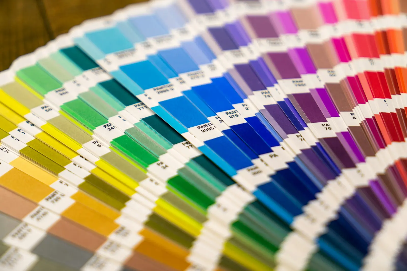
My audit gave me a short list of what mattered most:
- Colour and type, because they touch every single screen.
- Buttons, inputs and form errors, because healthcare forms are long and mistakes are costly.
- Tables and cards, because our dashboards are built almost entirely from them.
Everything else could wait. Saying no to the rest is what made the first version shippable.
03 · Tokens in three layers
Where a small system pays off
Design tokens are where a design system on a small team really earns its keep. I set mine up in Figma variables, in three layers, and each layer only points to the one directly below it:
| Layer | What it holds | Example |
|---|---|---|
| Primitive | Raw values | blue-600 = #3046E8 |
| Semantic | What a value is for | color/action/primary |
| Component | One component’s choices | button/bg/default |
- Primitive
- Raw values
- → blue-600 = #3046E8
- Semantic
- What a value is for
- → color/action/primary
- Component
- One component’s choices
- → button/bg/default
Components only ever use semantic or component tokens, never raw values. If we want a dark theme or a white-label version later, it’s a new mode on the semantic layer rather than a redesign. That one rule saves more time than anything else in the system.
04 · Components from real screens
Build it twice before you make it a component
I only turned something into a component after I’d seen it used at least twice in real product work. That rule kept the library small and honest. Every component in it exists because a screen needed it, not because a design system checklist said it should.
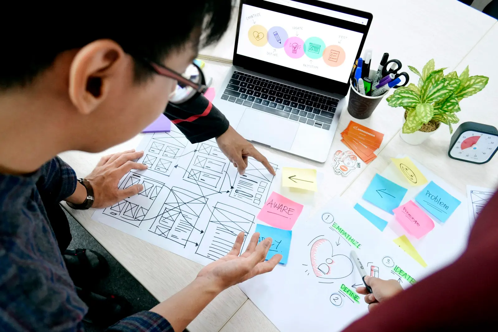
For each component I wrote a short note in its Figma description: when to use it, when not to, and the one mistake people usually make with it. Developers read those notes far more than I expected. Much more than they’d ever read a separate documentation site.
05 · Getting people to use it
Make it easier to use than to ignore
The hardest part wasn’t building the system. It was getting it used. A few things helped more than any amount of documentation:
- Pairing with developers on the first few screens, so tokens matched in code from day one.
- Naming things the way developers already talked about them, not the way I wanted to.
- Using the system to fix a real, annoying bug early, so people saw it save them time.
- Keeping a short changelog in Slack instead of a long docs page nobody opens.

06 · What I’d change
If I started again tomorrow
I’d bring a developer in from the first week, not the third. I’d check colour contrast on every semantic pair from the start instead of fixing accessibility issues later. And I’d write down why each decision was made. Six months on, the why is always the first thing you forget, and it’s the thing new people need most.
07 · FAQ
Questions people ask me about design systems
Can one designer build a design system?
Yes. Start small: audit what already exists, set up colour and type tokens, then build the handful of components your products use most. A focused system people actually use beats a complete one nobody adopts.
What should a design system include first?
Colour, typography and spacing tokens first. Then the components that appear on almost every screen, usually buttons, inputs, form errors, cards and tables. Documentation can start as short notes inside each component.
How do Figma variables help with design tokens?
Figma variables store tokens like colours and spacing in collections with modes. You can switch themes or brands by changing a mode, and the same structure can be exported to code so design and development stay in sync.