EV Green is a concept app that helps EV drivers in India find a free charger, hold it for 15 minutes and pay by UPI. Charging isn’t hard because of the charger. It’s everything around it.
- My role
- Solo product designer
- When
- V1 2024 · V2 2026
- Platform
- iOS · light & dark
- Scope
- 64 screens · 8 flows
By Vishnu Deva J · Updated
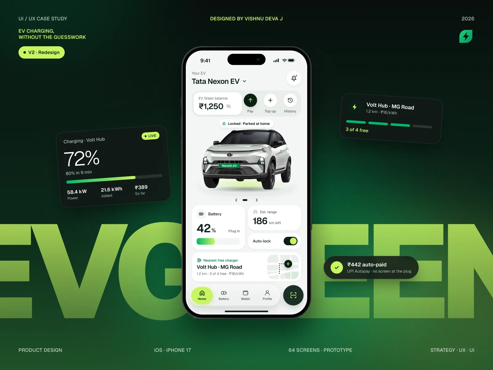
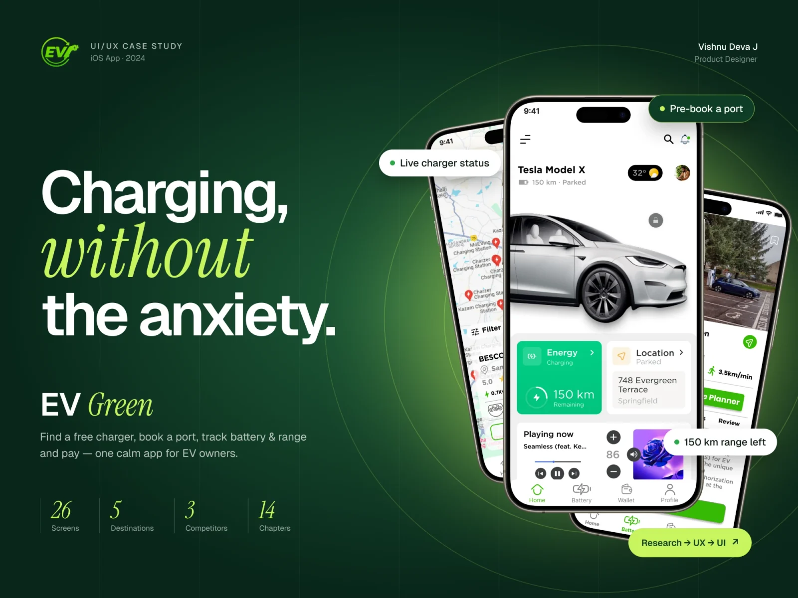
Drag to compare the 2024 version with the 2026 redesign. Read the V1 case study
The short version · 30 seconds
The problem
Drivers keep three or four charging apps, find “available” chargers that are already in use, and fight OTPs on one bar of signal.
What I did
Audited my own 2024 version, talked through real charging trips, then rebuilt the core flow around certainty instead of choice.
What changed
Starting a charge went from 7 screens to 3. Failures went from dead ends to 9 designed recovery screens.
- Screens to start charging
- 7 → 3
- Error states designed
- 0 → 9
- Time to charge · target
- <60s
01 · The problem
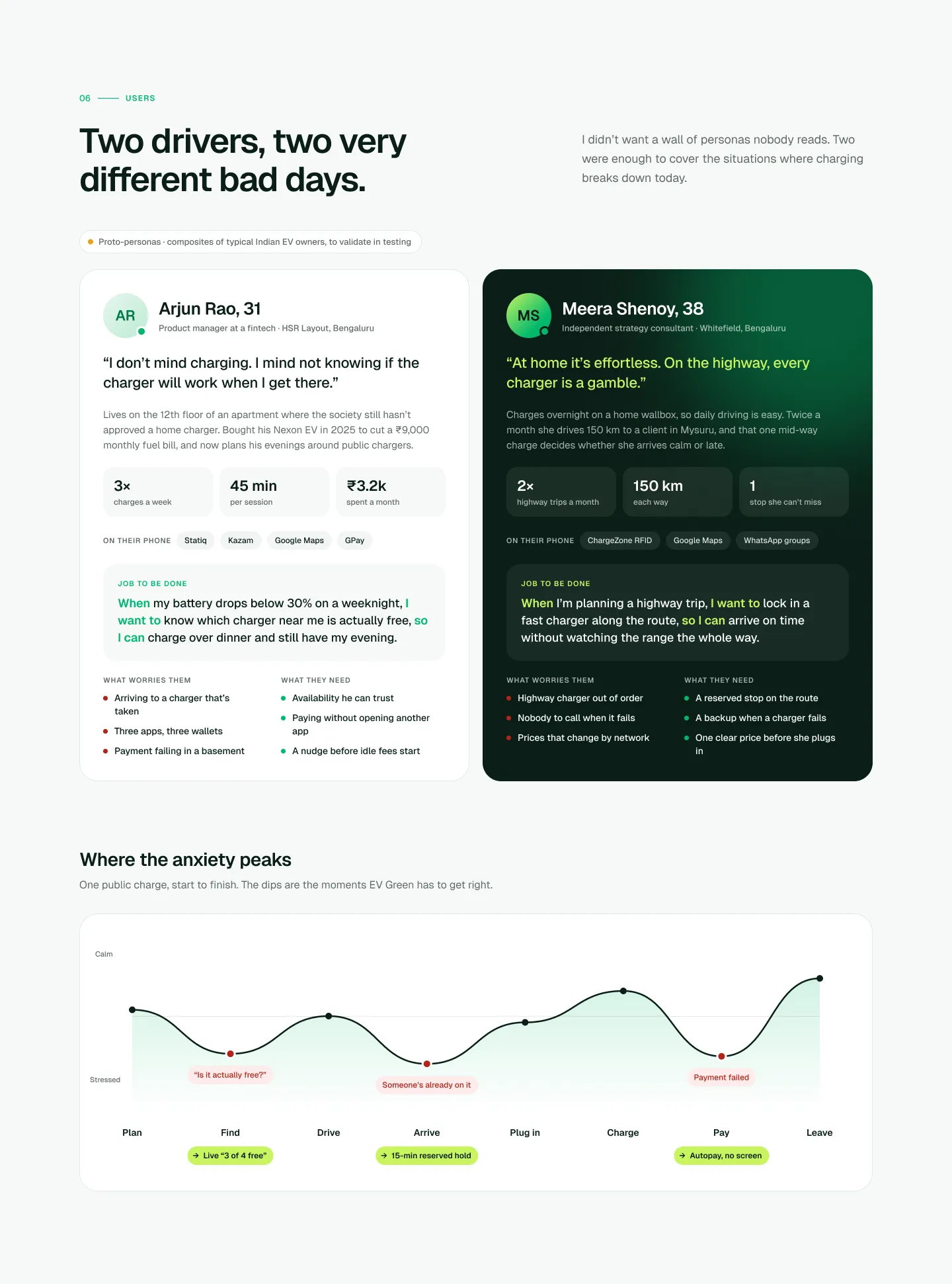
I started by mapping a real charging trip in Bengaluru: open an app, find a station, drive there, plug in, pay. Most of the stress didn’t come from charging. It came from not knowing if the charger would be free, and juggling a different wallet for every network.
What I found
- Map pins looked the same whether a charger was free or taken
- Every network had its own app, wallet and top-up
- OTPs failed in basement car parks with weak signal
02 · What broke in V1
I went back to my first version and checked every screen against Nielsen’s usability heuristics, as if someone else had designed it. Four things stood out.
What I found
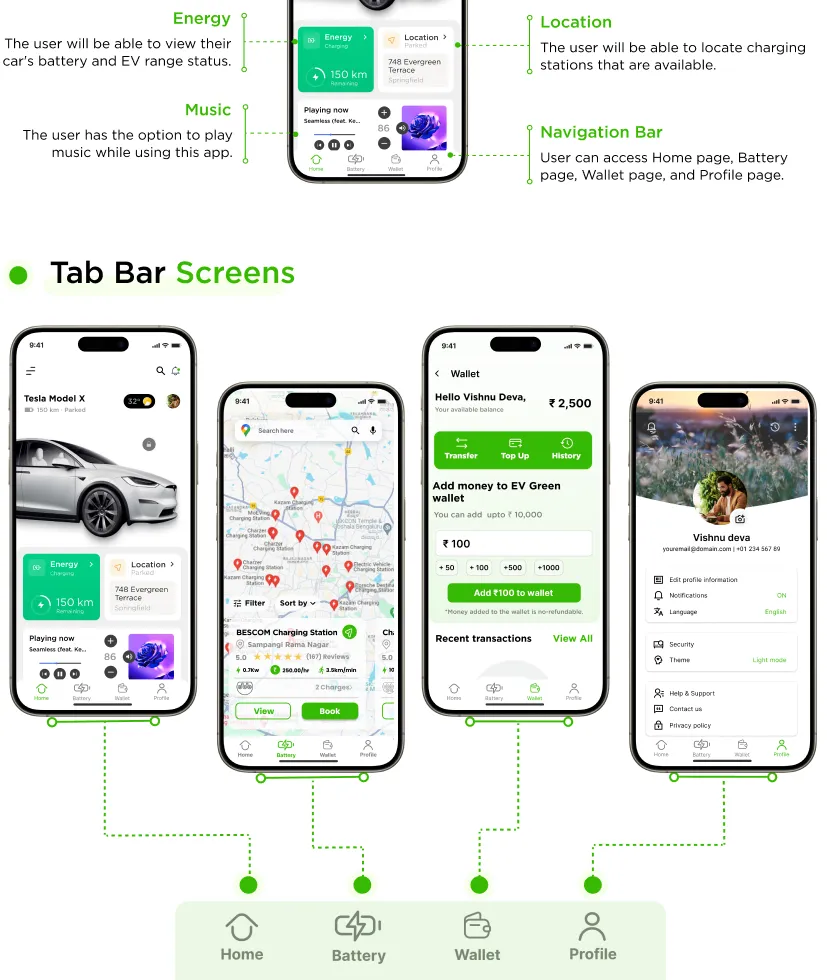
- A music player sat where battery and range should be
- It took seven screens to start a charge
- A failed payment was a dead end, with no way back
03 · Three decisions
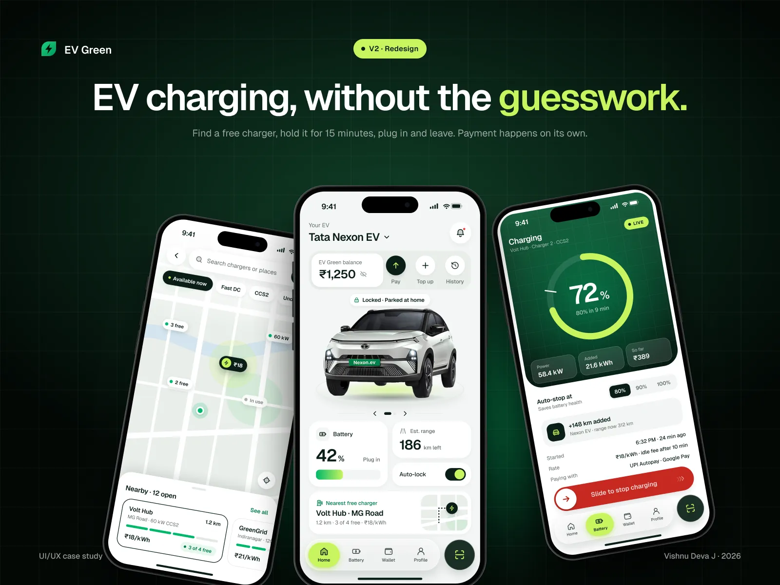
Show only free chargers
Problem: pins showed every station, busy or not.
Fix: the map shows only chargers you can use right now. It looks emptier, but every pin is a real option.
A 15-minute hold
Problem: you drive across town and someone takes the charger.
Fix: hold it for 15 minutes. Long enough for Bengaluru traffic, short enough that the operator doesn’t lose the slot.
Pay once, then forget
Problem: wallets, top-ups and OTPs at the plug.
Fix: set up UPI Autopay once during onboarding. Plugging in is the last thing you think about.
04 · Before and after
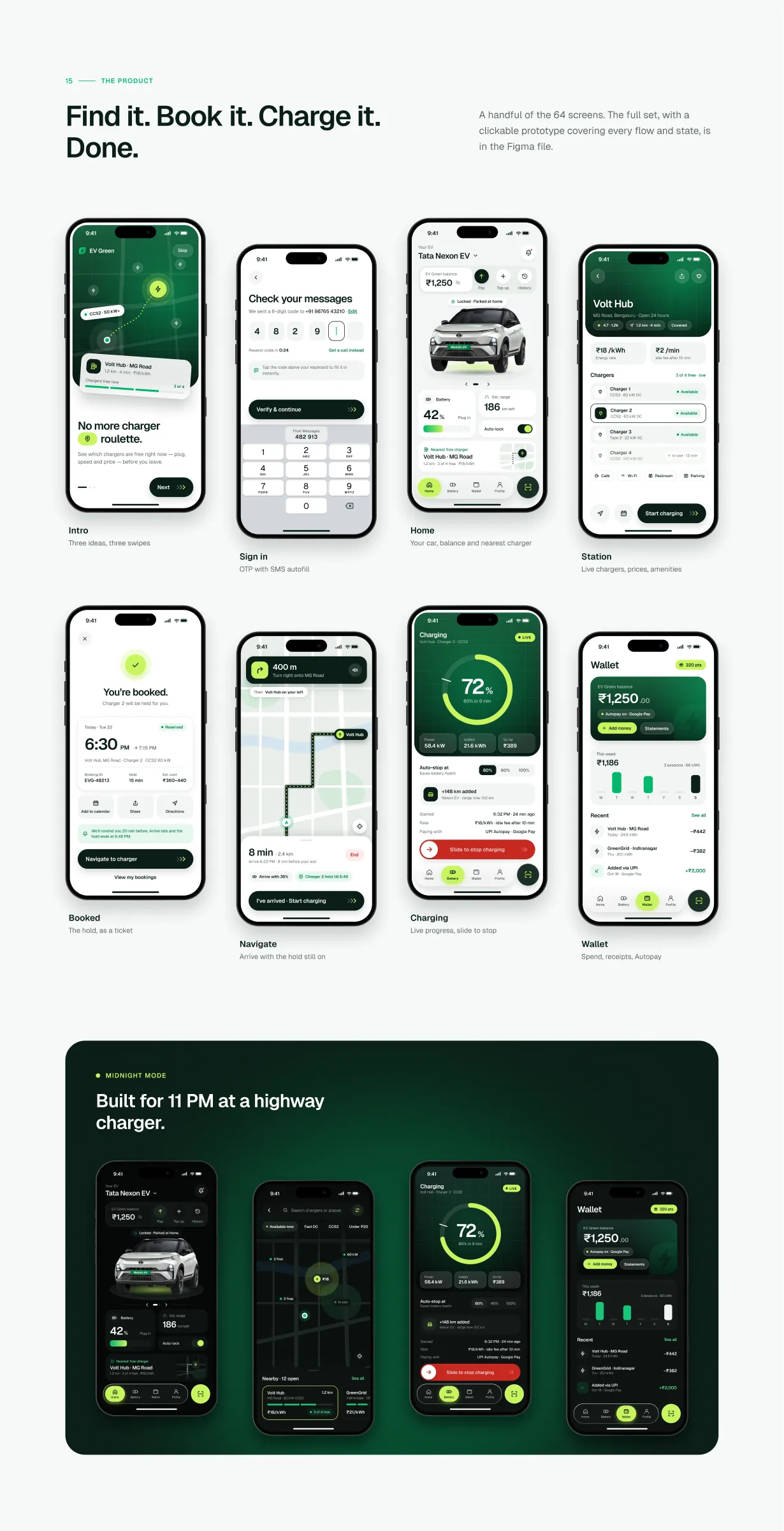
Drag the handle to compare. Left is V1 · 2024, right is V2 · 2026.
- Map
- V1 (2024): Every charger, busy or free
- V2 (2026): Only free chargers
- Getting a charger
- V1 (2024): Hope it’s free when you arrive
- V2 (2026): Hold it for 15 minutes
- Paying
- V1 (2024): Wallet, top-up, OTP at the plug
- V2 (2026): UPI Autopay, set up once
- Screens to charge
- V1 (2024): 7
- V2 (2026): 3
- When it fails
- V1 (2024): Dead end
- V2 (2026): 9 designed recovery screens
05 · Site map
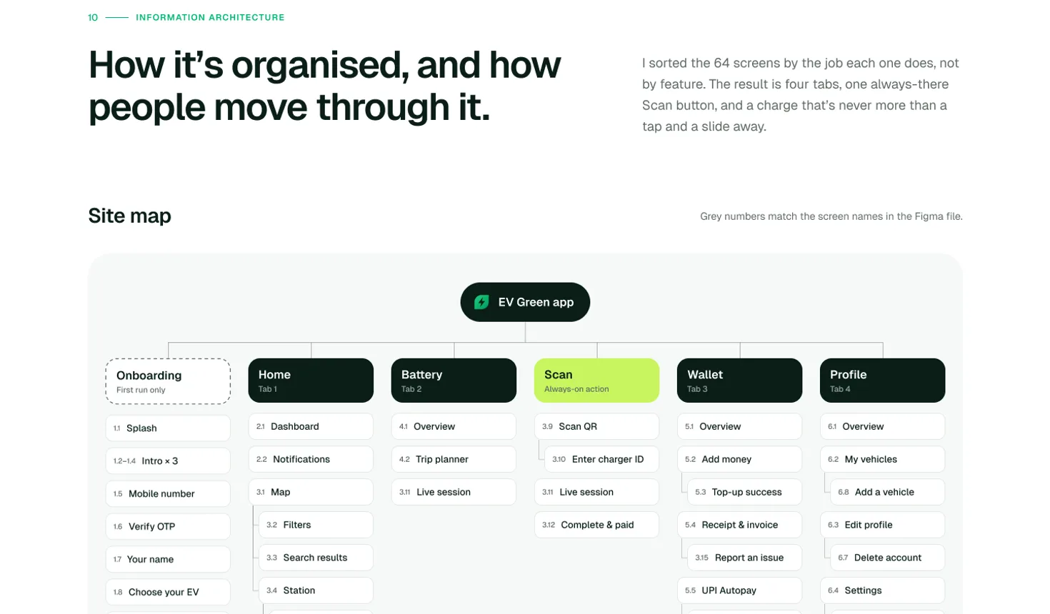
I sorted all 64 screens by the job each one does, not by feature. That left four tabs and a Scan button in the middle of the bar, because scanning is the most urgent thing anyone does in this app.
What I changed
- The map moved into Home, so it didn’t need a tab of its own
- Scan sits in the middle of the tab bar, one tap from anywhere
- Payment lives in Wallet. You set it up once and forget it
06 · Core user flow
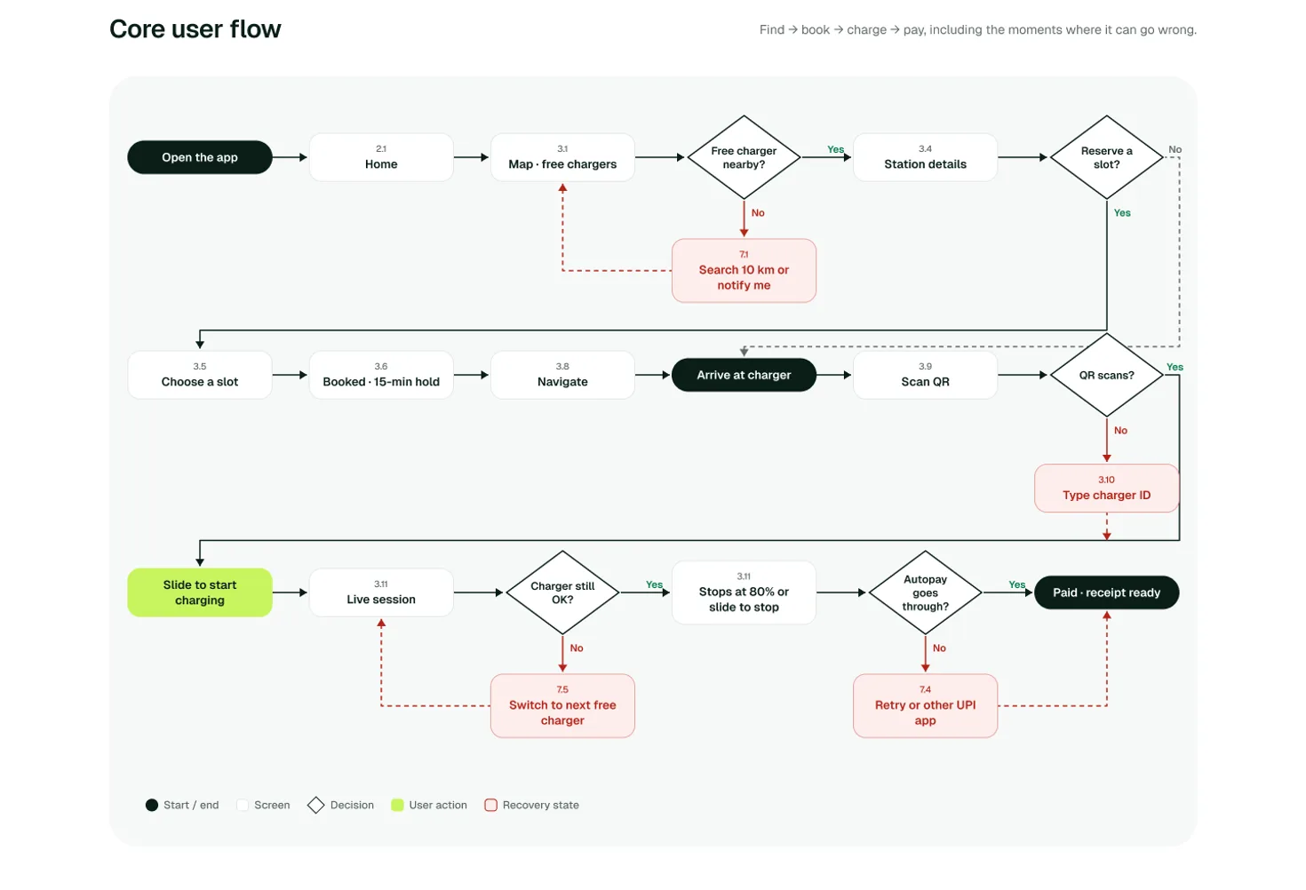
This is the path every driver takes: find a free charger, hold it for 15 minutes, drive there, scan and slide to start. I drew the failure paths first, because that’s exactly where the old version left people stuck.
What I changed
- Search, filters and booking merged into one map screen
- Charger taken when you arrive? You get the next free one, not an error
- QR won’t scan? Type the charger ID. Payment fails? Pick another UPI app
07 · Onboarding flow
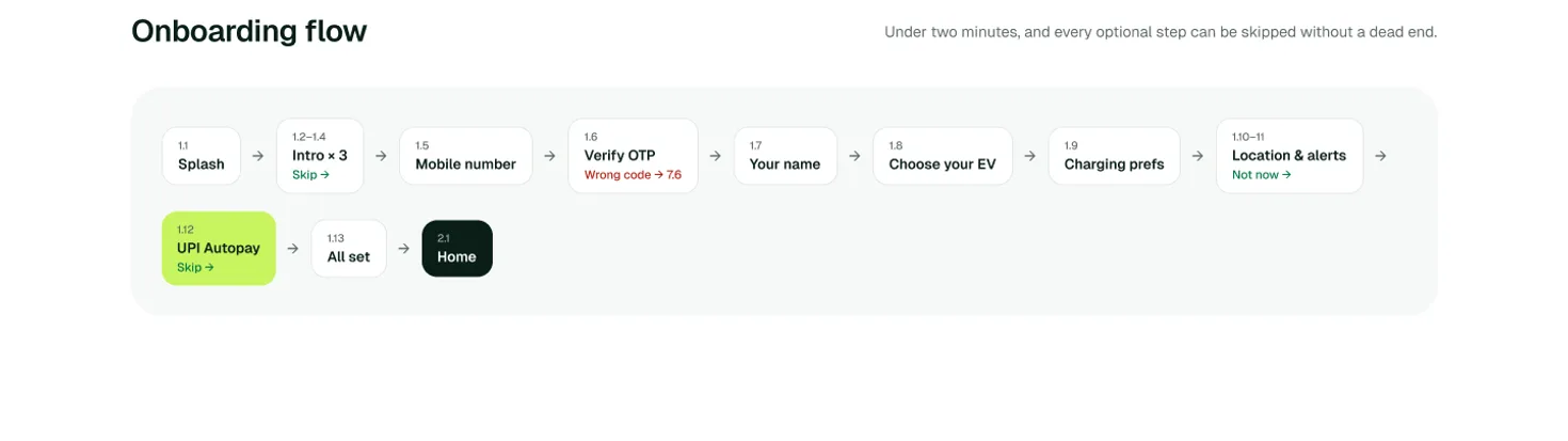
Onboarding does the boring work early. You add your car, how you like to charge and UPI Autopay once, so paying at the plug never needs a screen of its own.
What I changed
- Every optional step can be skipped without hitting a dead end
- UPI Autopay is set up here, not while you’re standing at the charger
- Location and alerts can wait. “Not now” is a real option
08 · Designing for bad days
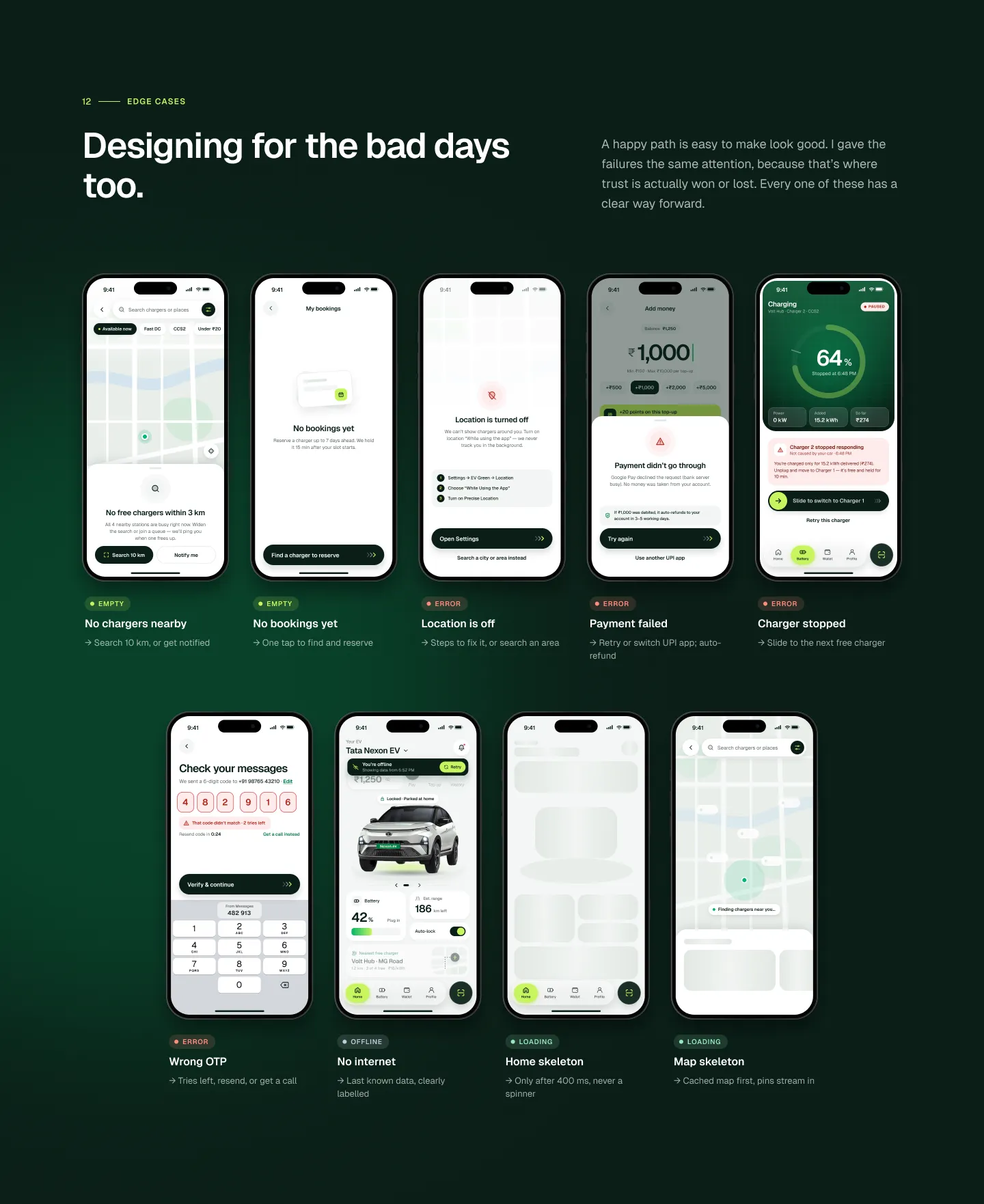
V1 had no plan for failure. In V2, a charger going offline, a declined payment or a dropped connection each gets its own screen that says what happened and what to do next.
What I changed
- No chargers nearby: shows the closest ones and how far
- Payment failed: shows if money left your account, and retries
- No signal: the hold and the session keep working offline
09 · Testing
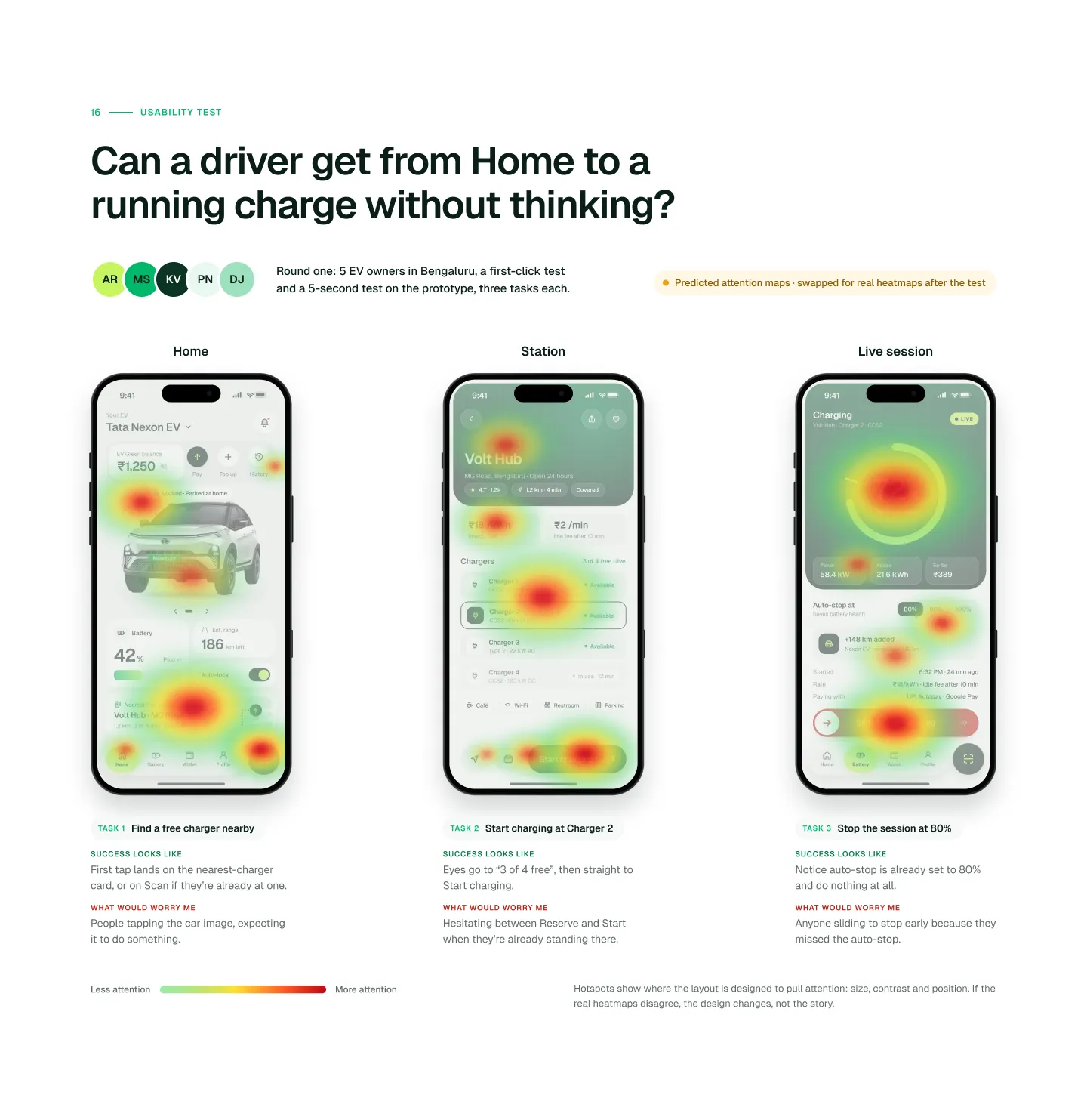
That’s the question for round one: five EV owners in Bengaluru, a first-click test and a five-second test, three tasks each. The heatmaps are my predictions of where people will look. Real results will replace them, and if they disagree, the design changes.
What I’ll test
- Task 1: find a free charger nearby
- Task 2: start charging at Charger 2
- Task 3: stop the session at 80%
10 · How I’ll know it works
These are the numbers I’d hold the product to once it’s live.
- From app open to charging
- < 60s
- EV owners in round one
- 5
- A/B tests to run first
- 2
11 · What I’d do differently
Talk to operators earlier. Availability data is only as good as what they share, and that shaped half my decisions.
Test the hold timer one-handed. Drivers check it at traffic lights, not at a desk.
Design for Kannada and Hindi from day one. Adding languages later means redoing every layout.
This is the 2026 redesign. See where it started: EV Green V1 (2024) →
Next project
Joy Vision
Travel India in your own language.