Joy Vision is a concept travel app for India that plans the trip, books the stay and helps you talk to locals in their language. Booking is easy. Getting through the trip in a language you don’t speak isn’t.
- My role
- Solo product designer
- When
- V1 2024 · V2 2026
- Platform
- iOS · iPhone 17
- Scope
- V1 audit → V2 redesign
By Vishnu Deva J · Updated
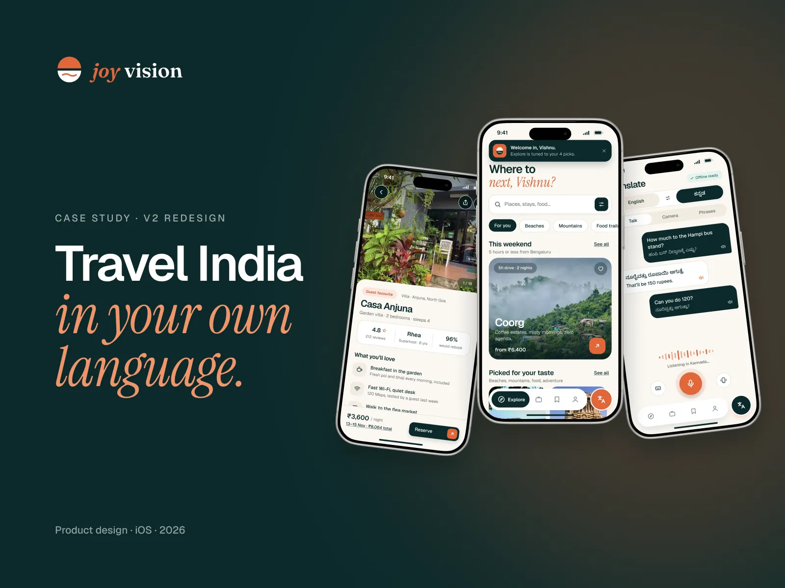
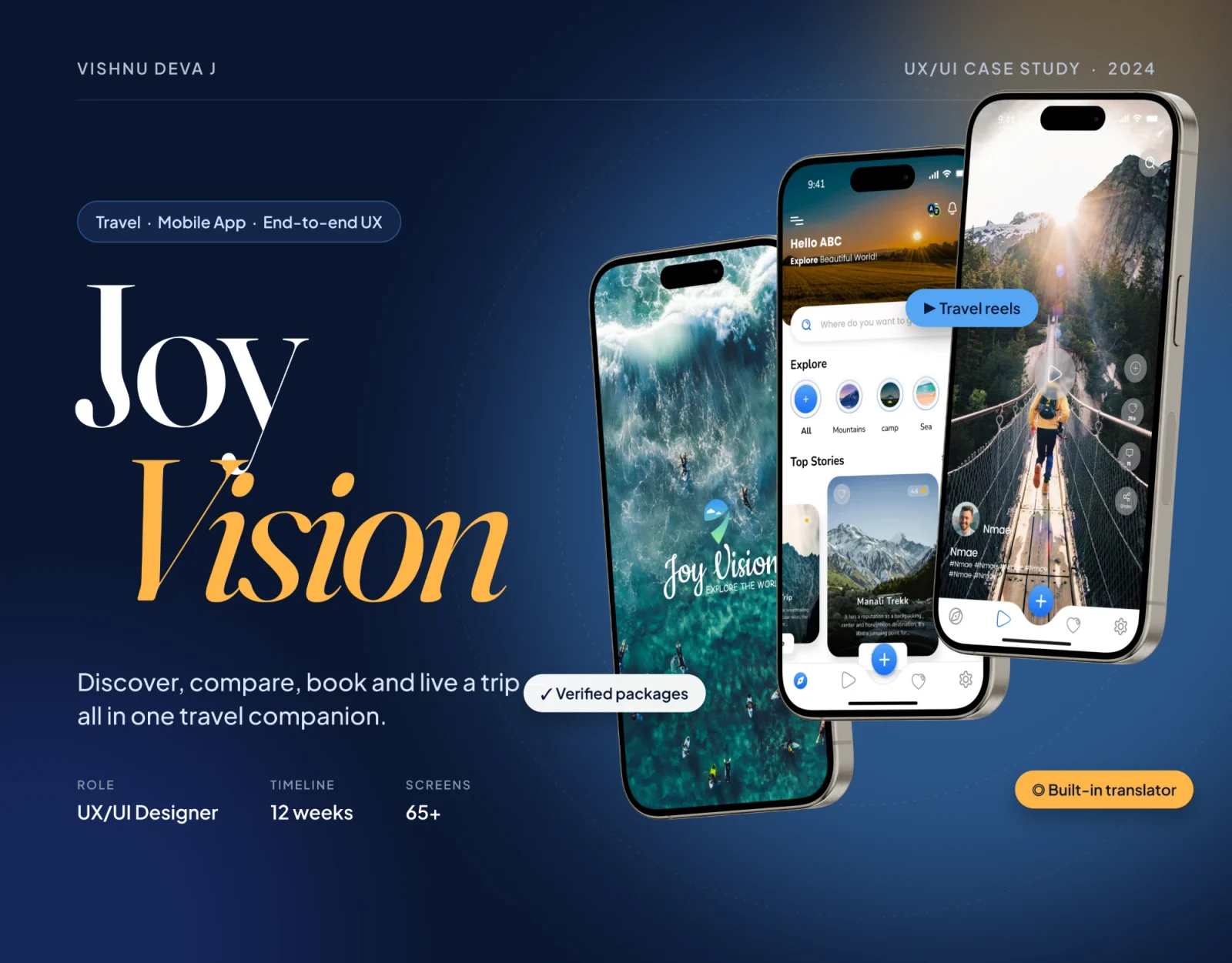
Drag to compare the 2024 version with the 2026 redesign. Read the V1 case study
The short version · 30 seconds
The problem
V1 looked like every travel app. Its one unique feature, Translate, hid behind a small icon, and nothing was designed for when things went wrong.
What I did
Audited all 65+ of my 2024 screens, went back to the interviews, then rebuilt the app around Translate and a shorter, UPI-first checkout.
What changed
Planning a trip went from 10 screens to 3. Checkout went from 8 to 4. Thirteen error states now exist where V1 had none.
- Screens to plan a trip
- 10 → 3
- Checkout screens
- 8 → 4
- To Translate, from anywhere
- 1 tap
01 · The problem
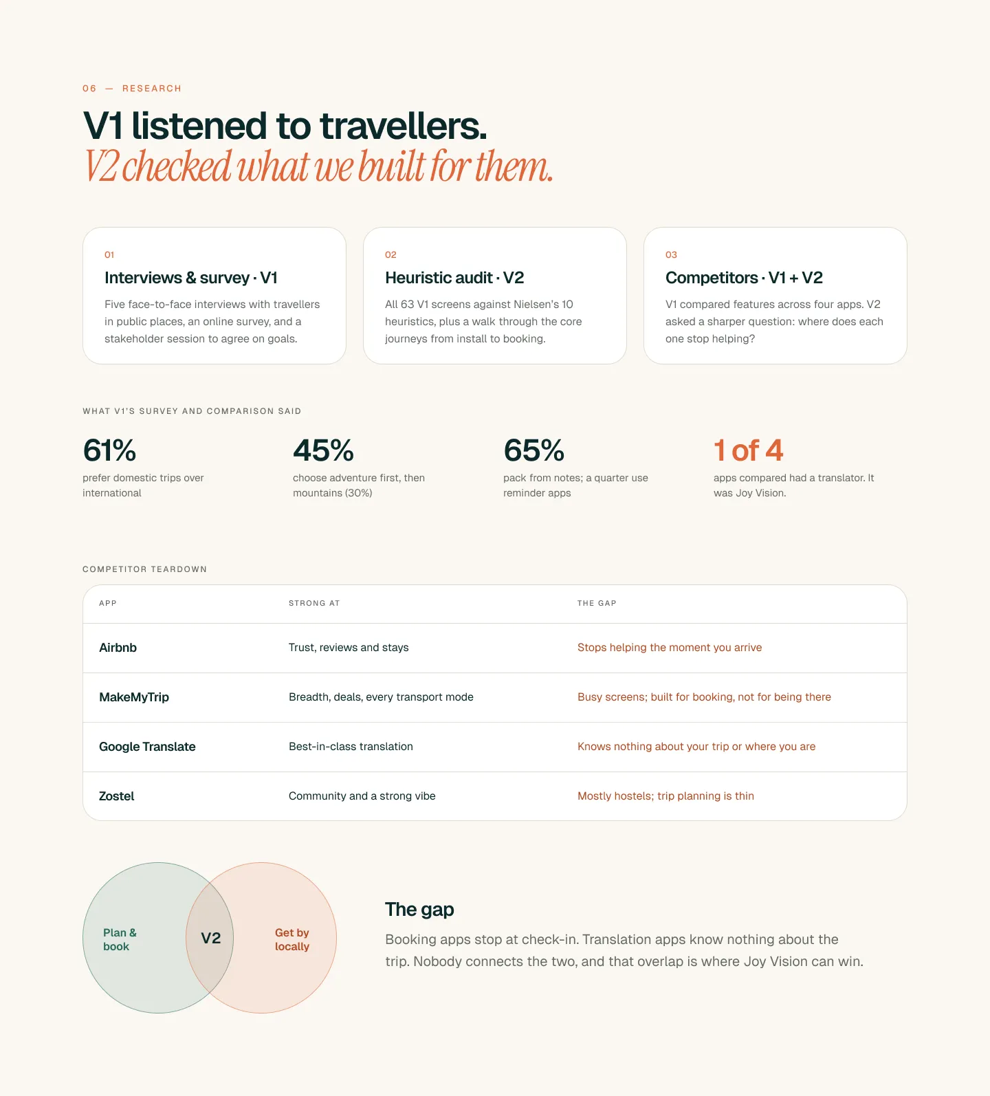
A Bengaluru couple in Gokarna or a Delhi family in Madurai can book the trip in minutes. The hard part comes after: ordering from a menu with no English, agreeing an auto fare at 6 am, asking where the bus stops. Often on weak signal.
What I found
- Booking apps stop helping the moment you arrive
- Translation apps know nothing about your trip
- Nobody connects the two, and that gap is where Joy Vision fits
02 · What broke in V1
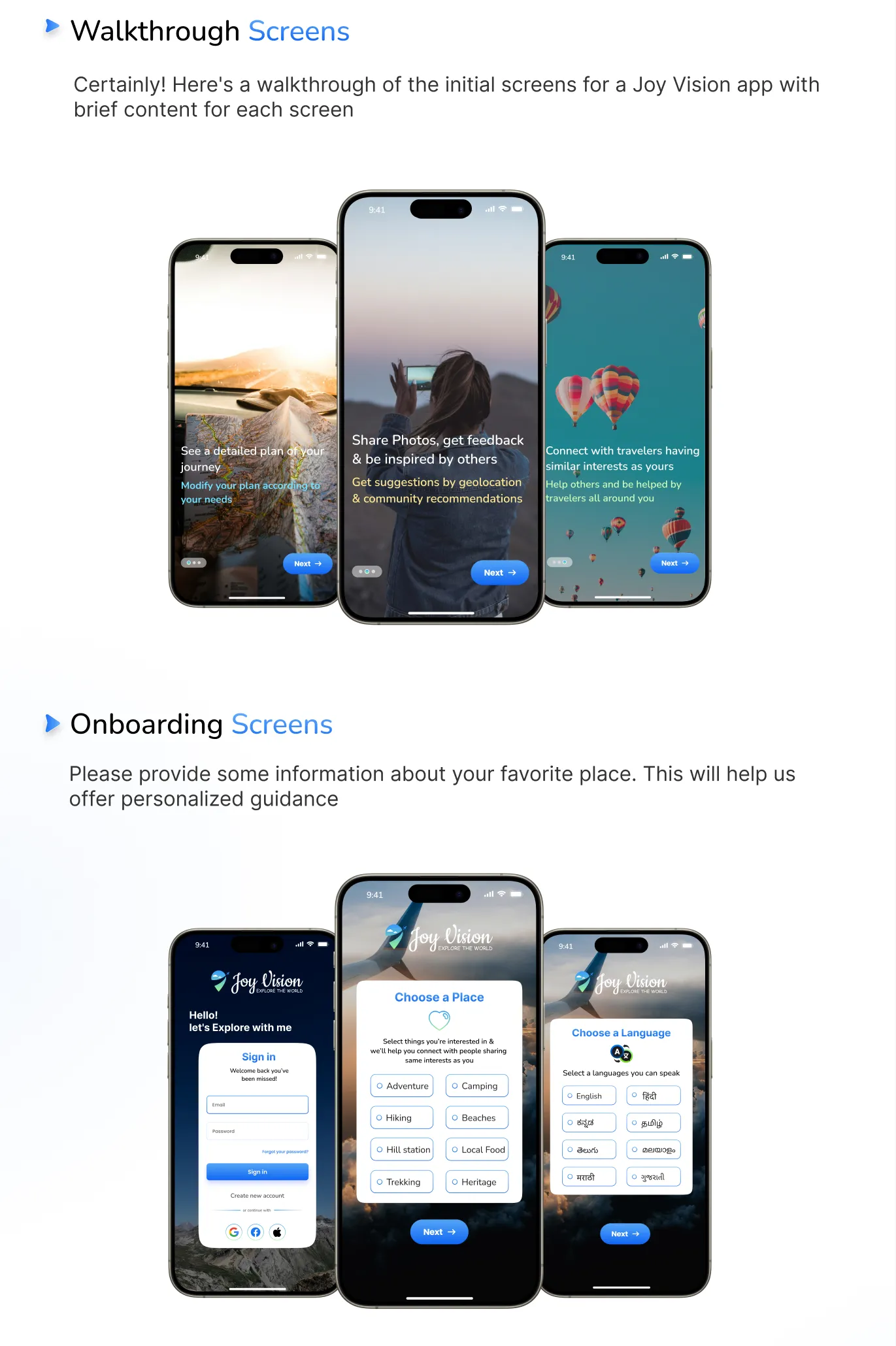
I went back to all 65+ V1 screens and checked each one against Nielsen’s usability heuristics, as if someone else had designed them. Three things stood out.
What I found
- Translate, the reason to install the app, hid behind a header icon
- Planning a trip took ten screens
- Not one error state was designed. A failed payment just stopped
03 · Three decisions
Translate gets its own button
Problem: the best feature hid behind a small icon.
Fix: a raised button next to the dock, one tap from any screen. It costs a slot for future features, and it’s worth it.
UPI first, cards second
Problem: a card form and an OTP on weak signal.
Fix: UPI apps sit on top and cards one tap below. Checkout drops from 8 screens to 4, with the full price and GST shown first.
One sheet for where, when and who
Problem: ten screens just to plan a trip.
Fix: one sheet asks one question at a time, and answers fold into a summary you can tap. “I’m flexible” handles open dates.
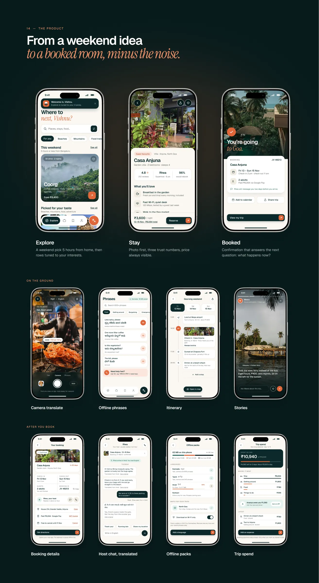
04 · Before and after
Drag the handle to compare. Left is V1 · 2024, right is V2 · 2026.
- Translate
- V1 (2024): A small icon in the header
- V2 (2026): Its own button, one tap from anywhere
- Planning a trip
- V1 (2024): Ten screens
- V2 (2026): One sheet, one question at a time
- Paying
- V1 (2024): Card form first, then an OTP
- V2 (2026): UPI first, full price with GST up front
- Checkout screens
- V1 (2024): 8
- V2 (2026): 4
- When it fails
- V1 (2024): Nothing designed
- V2 (2026): 13 designed error states
05 · Site map
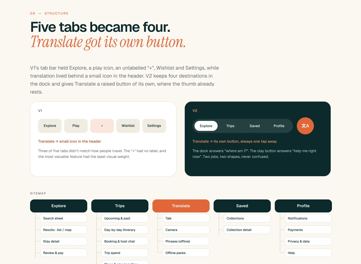
V1’s tab bar held Explore, a play icon, an unlabelled “+”, Wishlist and Settings. V2 keeps the four places people actually go, and puts Translate on a raised button where the thumb already rests.
What I changed
- The play icon and the unlabelled “+” are gone
- Trips holds bookings, the day-by-day plan and spend together
- Translate has talk, camera and offline phrase packs in one place
06 · Core user flow
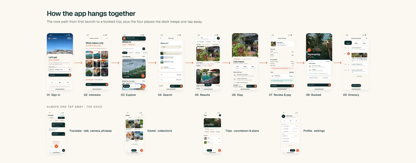
Sign in, pick what you enjoy, explore, search, choose a stay, review and pay, and your day-by-day plan is ready. Each screen does one job, and the dock keeps Translate, Trips, Saved and Profile one tap away.
What I changed
- Search lives in one sheet instead of ten screens
- Review and pay shows the full price with GST before you tap
- UPI times out? Nothing is booked, and the room is held for 15 more minutes
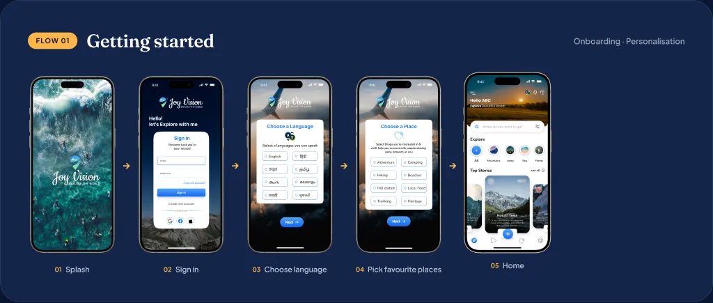
07 · Onboarding flow
Sign in, choose the languages you speak, pick the kind of places you love, and Home opens with picks that match. Sharing a few favourite places is what lets the app personalise from the very first session.
Why it works
- Language comes first, because it powers Translate from day one
- Interests replace a blank home with places you’d actually go
- Google, Facebook and Apple sign-in, so nobody has to make a new password
08 · Designing for bad days
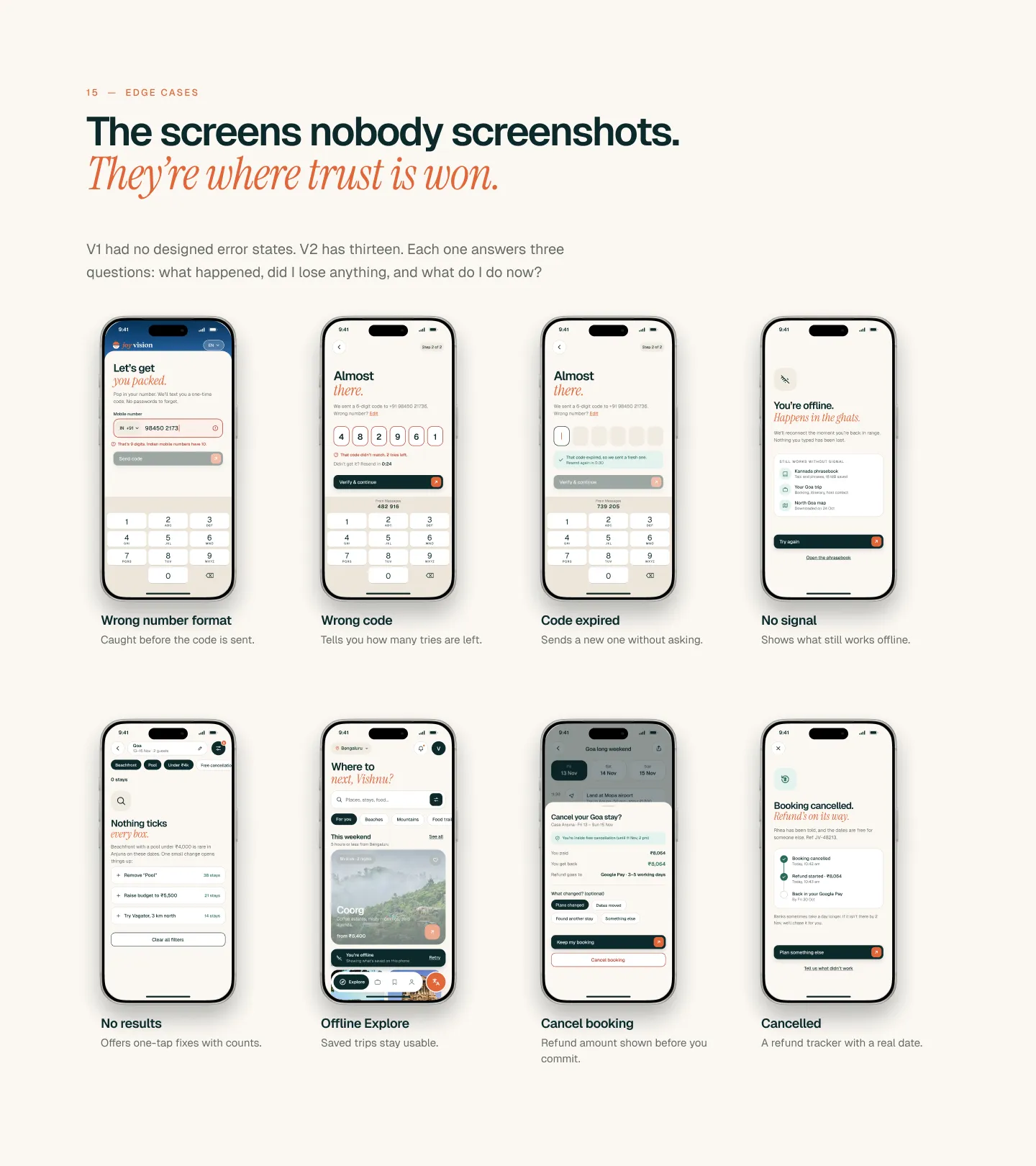
V1 had no designed error states. V2 has thirteen, and each one says what happened, whether you lost anything and what to do next.
What I changed
- Payment failed: says whether money was taken, and what to do next
- No signal: Translate keeps working with offline phrase packs
- UPI timed out: nothing is booked, and the room stays held
09 · Testing
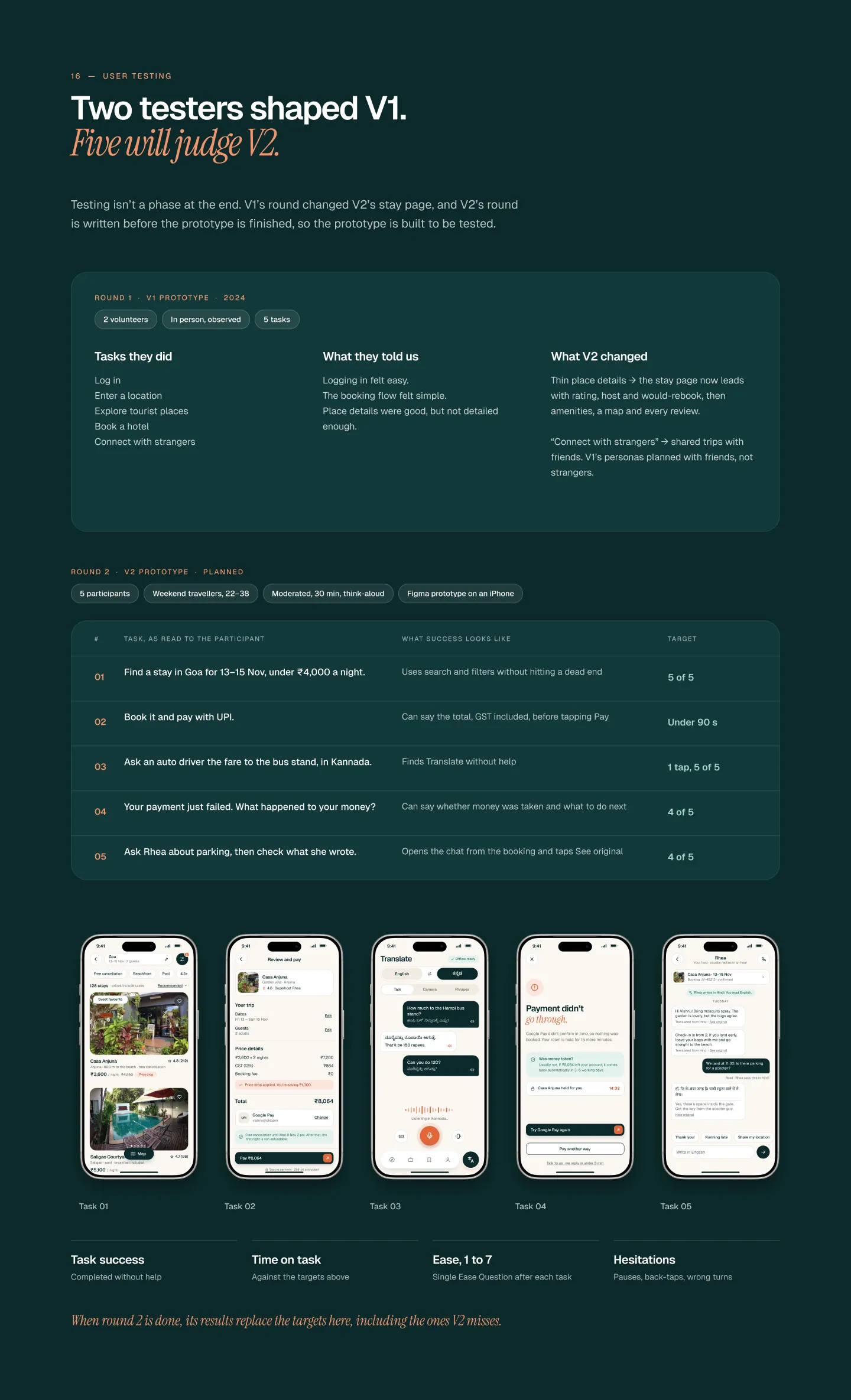
V1 was tested with two volunteers, and what they said changed the stay page. Round two is planned with five weekend travellers aged 22 to 38, thinking aloud on an iPhone prototype for 30 minutes each.
What I’ll test
- Find a stay in Goa under ₹4,000 a night and pay with UPI
- Ask an auto driver the fare to the bus stand, in Kannada
- Your payment just failed. What happened to your money?
10 · How I’ll know it works
These are the numbers I’d hold the product to once it’s live.
- Translate adoption · target
- 40%+
- Time to first value · target
- < 3 min
- Money tickets · target
- −30%
11 · What I’d do differently
Test with more people. V1 was tested with two volunteers. V2 gets five people per round, and two rounds.
Design offline from day one. Offline states came late and touched almost every flow. Next time, “no signal” goes in the brief.
Bring an engineer in early. The UPI waiting screen and refund tracker depend on backend states, and that conversation belongs in week one.
This is the 2026 redesign. See where it started: Joy Vision V1 (2024) →
Next project
EV Green
EV charging, without the guesswork.