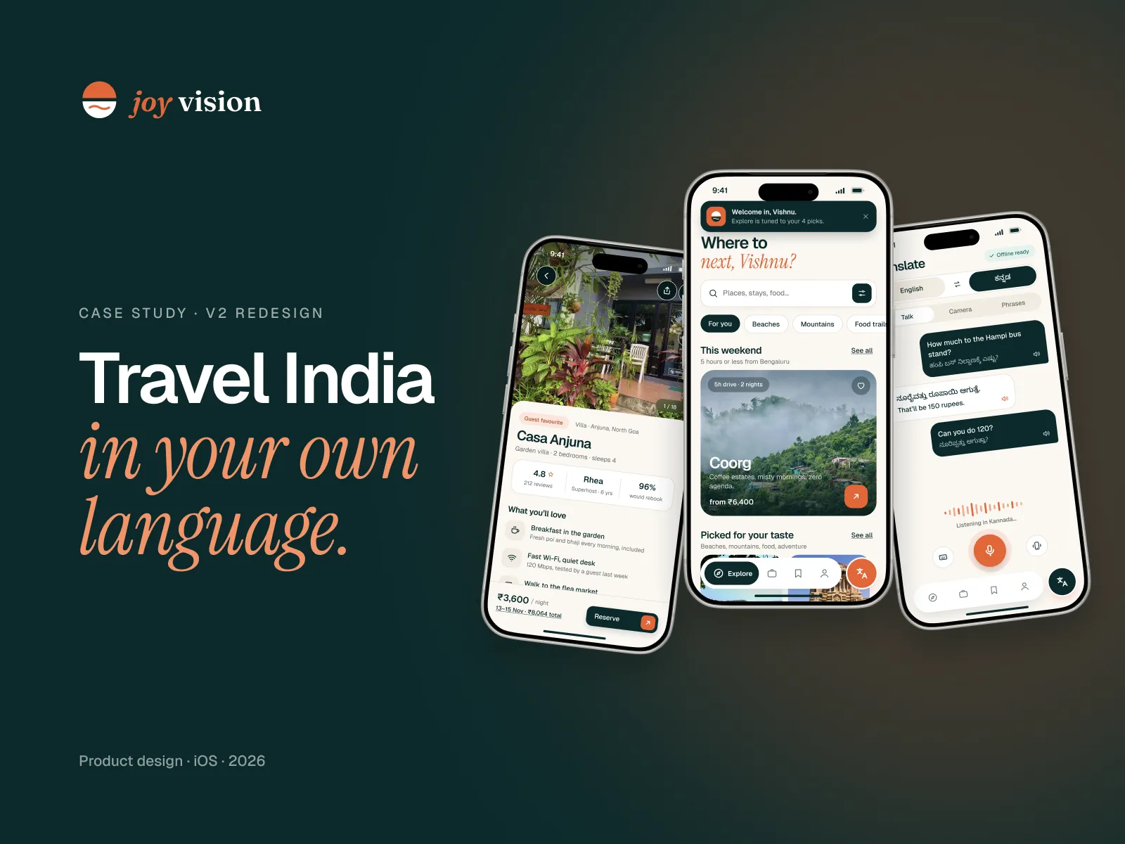
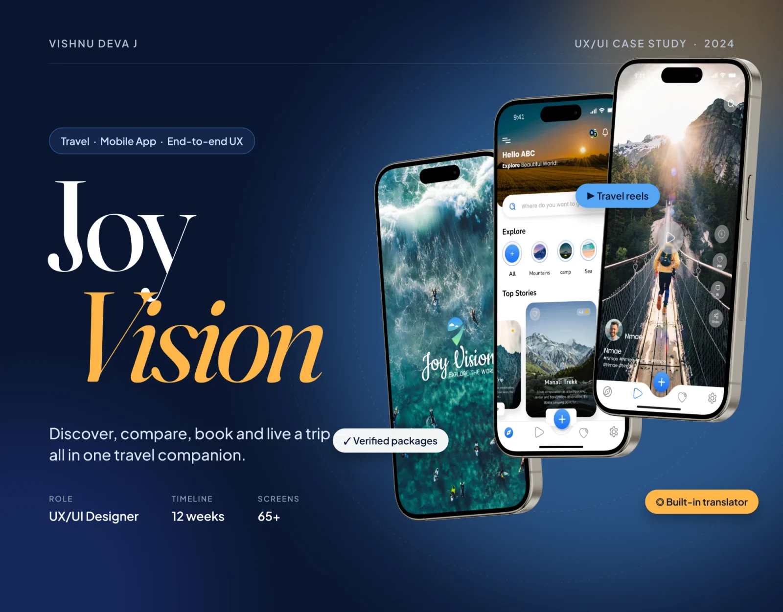
Joy Vision V1 is the 2024 first version of a travel app: one companion to discover, compare, book and live a trip, instead of juggling ten apps. It’s the version I later audited and rebuilt.
- My role
- Solo UX/UI designer
- When
- 2024 · 12 weeks
- Platform
- iOS · mobile app
- Scope
- 65+ screens · UI kit
By Vishnu Deva J · Updated
The short version · 30 seconds
The problem
Travel planning was scattered. People bounced between Google, videos, blogs and group chats just to pick a place, then fought agencies, prices and language on the trip.
What I did
Ran five traveller interviews, a survey and a competitor audit, built two personas and a journey map, then designed the whole app myself in 12 weeks.
What changed
65+ high-fidelity screens, a reusable UI kit and a tested prototype. Testers found login and booking easy, and asked for richer place details.
- Traveller interviews
- 5
- Screens designed
- 65+
- Solo, end to end
- 12 wks
01 · The problem
It started with a friend who travels solo, with friends and with family, and kept hitting the same walls: picking a destination, finding agencies and hotels he could trust, and keeping the group’s budget and plans in one place.
What I found
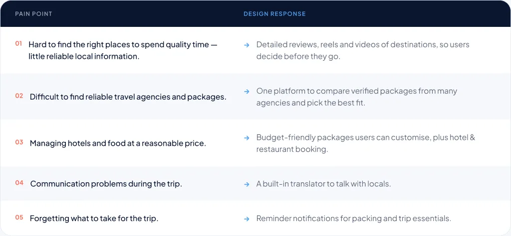
- Good local information was hard to find, so choosing a place took ages
- Agencies and packages were hard to trust, and prices hard to compare
- Language became a real problem once people arrived
02 · Research
I started with a stakeholder interview, then talked to five travellers face to face, ran an online survey and compared three travel apps feature by feature. Each covered part of the trip. None covered all of it.
What I found
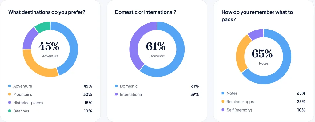
- 61% prefer domestic trips over international ones
- 45% pick adventure first, then mountains at 30%
- 65% remember what to pack with notes, a quarter use reminder apps
03 · What I designed for
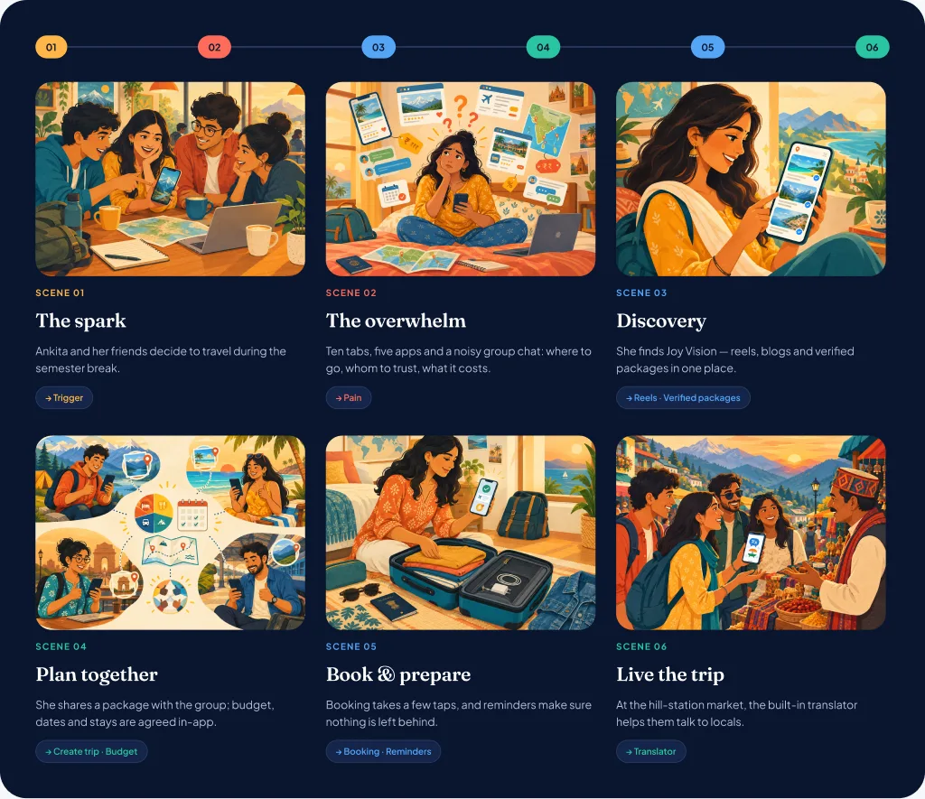
One place for verified packages
Problem: ten tabs, five apps and a noisy group chat just to pick a trip.
Fix: compare verified packages from many agencies, with reels and blogs to help you decide.
Plan it together
Problem: budgets, bookings and opinions lived in different chats.
Fix: share a package with the group and agree dates, stays and budget inside the app.
Help on the trip
Problem: language barriers and forgotten essentials spoiled trips.
Fix: a built-in translator to talk to locals, and reminders for what to pack.
04 · Who I designed for
- Who
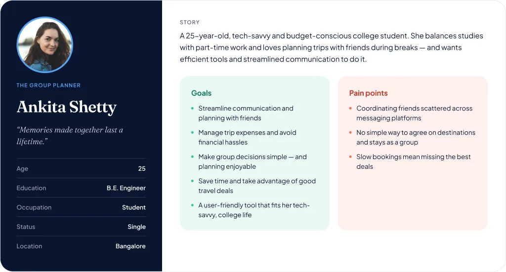
- Ankita, 25: Student in Bangalore
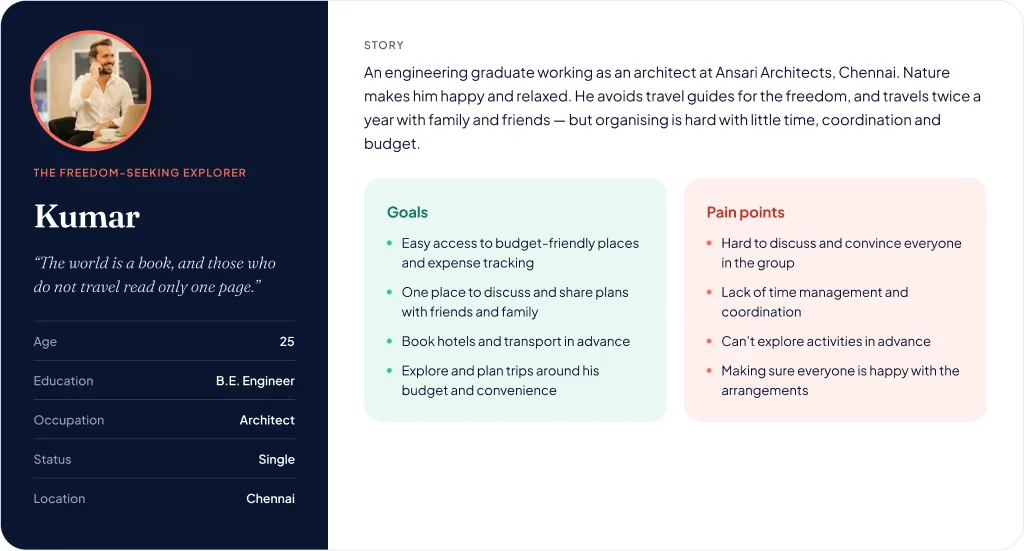
- Kumar, architect: Architect in Chennai
- Travels
- Ankita, 25: With friends, in semester breaks
- Kumar, architect: Twice a year, with family and friends
- Wants
- Ankita, 25: Easy group plans and good deals
- Kumar, architect: Budget-friendly places, booked ahead
- Struggles with
- Ankita, 25: Friends spread across chat apps
- Kumar, architect: Getting the whole group to agree
- Needs from the app
- Ankita, 25: Group decisions made simple
- Kumar, architect: One place to plan and share
05 · Information architecture
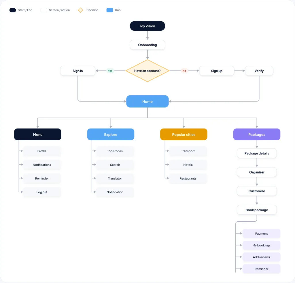
Card sorting showed me where people expected to find things. That gave a shallow, explore-first structure: sign in once, and the main hubs are a tap from Home.
How it’s built
- Card sorting grouped features the way travellers expected
- Packages lead to details, organiser, customise and book
- Popular cities branch into transport, hotels and restaurants
06 · Core user flow
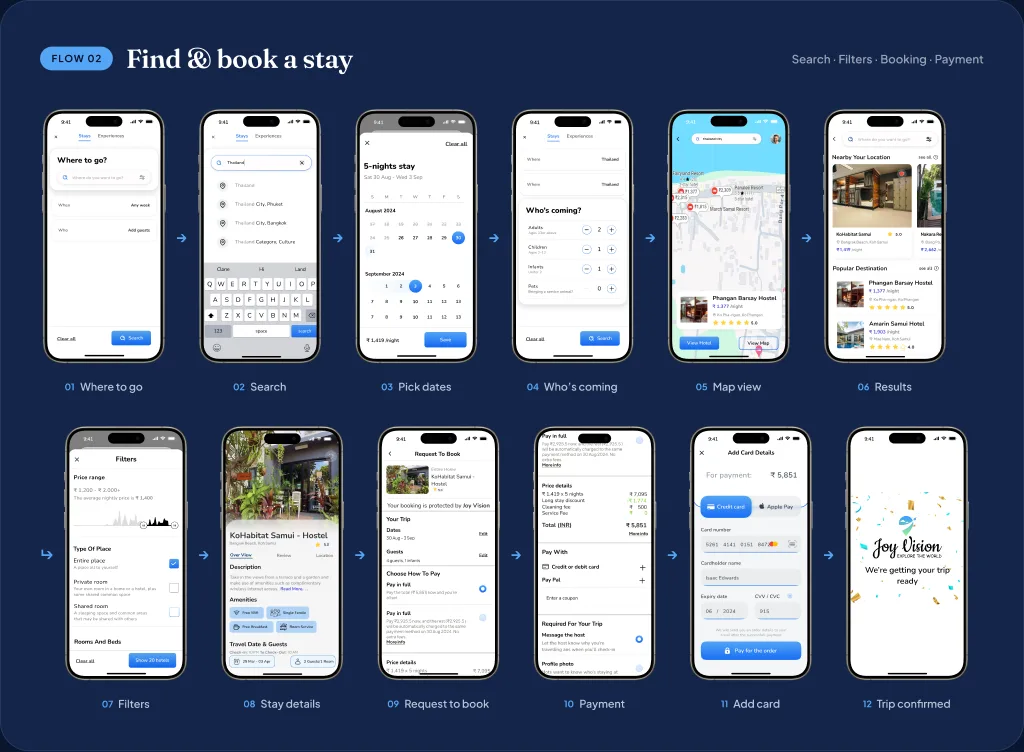
This was the job that mattered most: pick where to go, the dates and who’s coming, compare results on a map, check the stay and pay. I mapped what happens when a payment fails, too.
How it works
- Where, when and who come first, so results fit the trip
- Map view and filters sit right on the results screen
- A failed payment goes back to retry, not to a dead end
07 · Onboarding flow
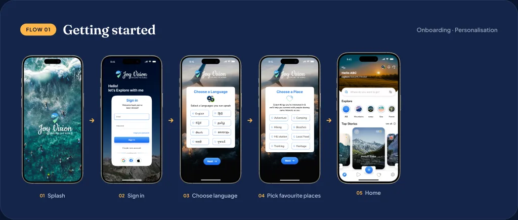
Sign in, choose the languages you speak, pick the kind of places you love, and Home opens with picks that match. Sharing a few favourite places is what lets the app personalise from the very first session.
Why it works
- Language comes first, so the translator is ready from day one
- Interests replace a blank home with places you’d actually go
- Google, Facebook and Apple sign-in, so nobody has to make a new password
08 · Design system
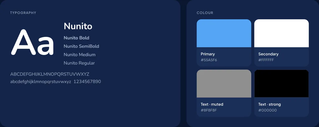
Wireframes and a heuristic check came first, then a UI kit: Nunito for friendly, easy reading and a sky-blue primary for trust. Every screen was built from the same components.
What’s in it
- One type family, Nunito, in four weights
- Four colours, led by sky blue #55A5F6
- Reusable cards, inputs, buttons and a bottom bar
09 · Testing
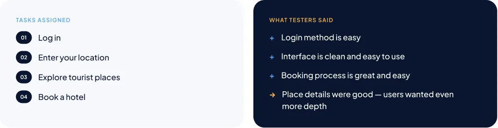
Two volunteers worked through the prototype while I watched where they hesitated. They found login and booking easy, liked the clean layout, and asked for more detail on each place.
The tasks
- Log in, then enter your location
- Explore tourist places
- Book a hotel
10 · What it delivered
A complete design, built and tested by one person.
- High-fidelity screens
- 65+
- Usability testers
- 2
- Tasks in the test
- 4
11 · What I took forward
Research earns the design. Every core feature, from the translator to reminders and package comparison, traces back to an interview or the survey.
Trust is a feature. Travellers told me fake reviews kill confidence, so verified agencies and verified reviews matter as much as any screen.
Go deeper next time. Richer place details were the top request, and I’d test with more group travellers and measure how many finish a booking.