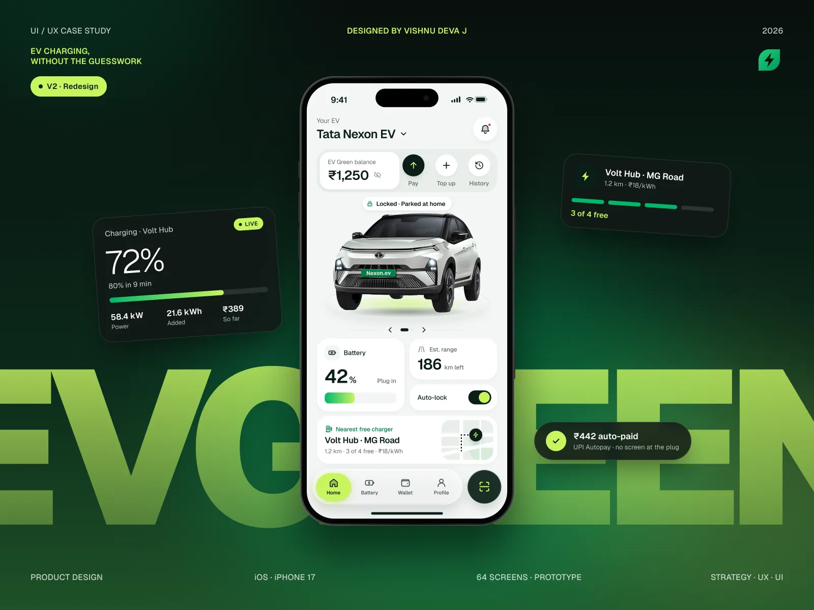
EV Green V1 is the 2024 first version of an EV charging app: find a free charger, book a port, track battery and range, and pay, all in one calm app. It’s the version I later audited and rebuilt.
- My role
- Solo UI/UX designer
- When
- 2024
- Platform
- iOS · iPhone
- Scope
- 26 screens · prototype
By Vishnu Deva J · Updated
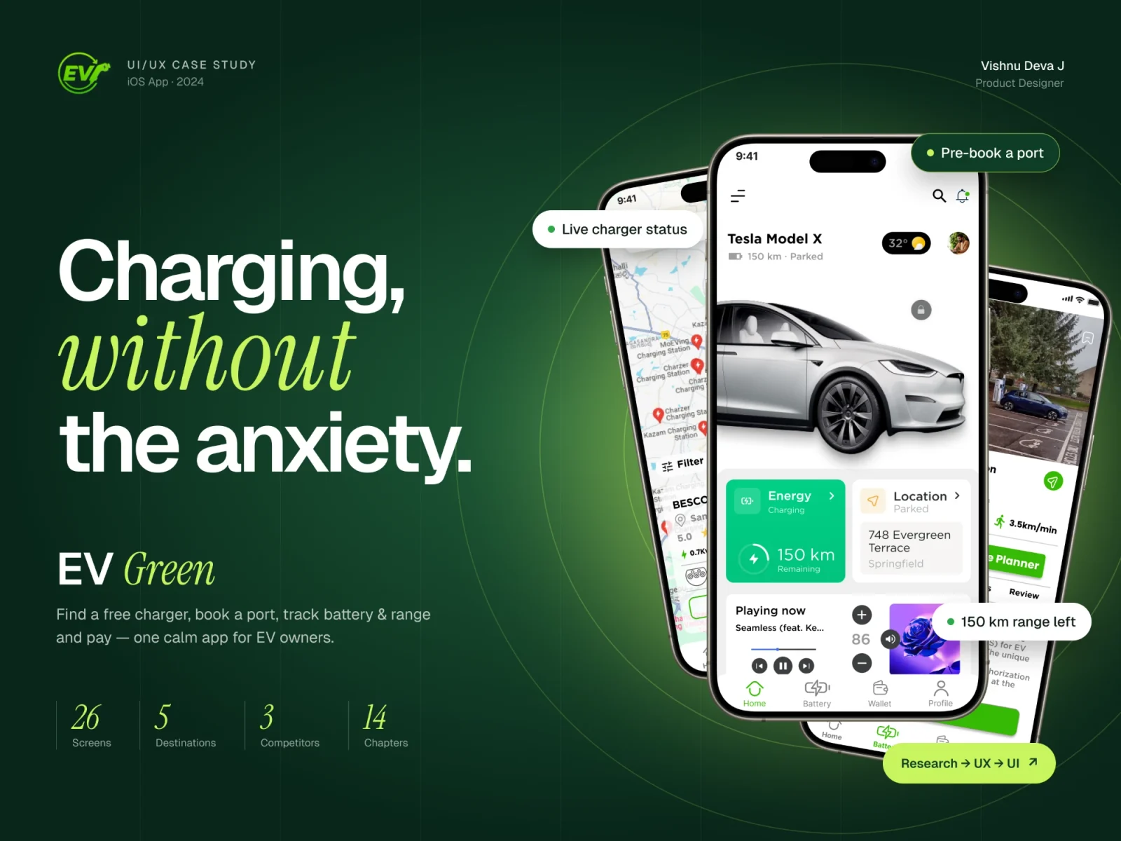
The short version · 30 seconds
The problem
EV owners plan every trip around chargers. Chargers show free and turn out busy, every network has its own app, and nothing shows live status.
What I did
Desk research, a benchmark of three Indian charging apps, an affinity map, a persona and a storyboard. Then paper sketches, wireframes and the UI in Figma.
What changed
26 high-fidelity iOS screens and a prototype that covers find, book, charge and pay. Auditing this version later is what led to V2.
- iOS screens
- 26
- Apps benchmarked
- 3
- Ideas in the MVP
- 9 of 12
01 · The problem
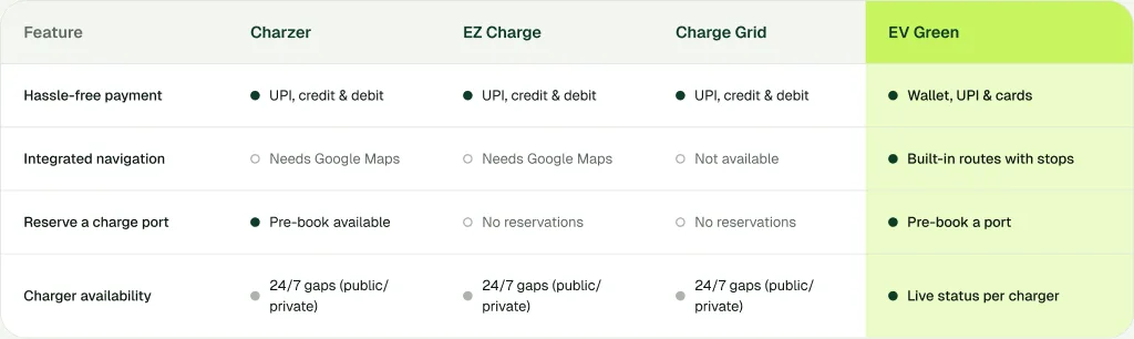
Desk research into India’s EV charging kept showing the same pattern: the cars are ready, the charging experience isn’t.
What I found
- Drivers arrive to find chargers busy or offline
- Every network has its own app, connector and payment
- Too few outlets make long trips feel risky
02 · Competitors
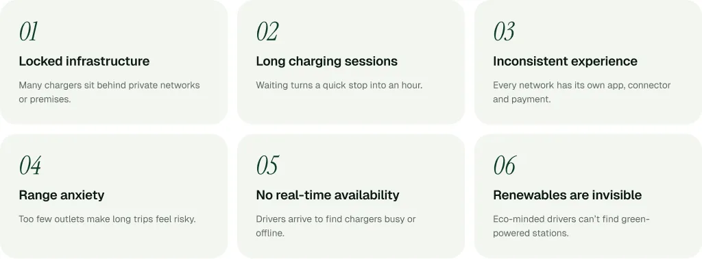
I benchmarked Charzer, EZ Charge and Charge Grid on the four jobs that matter most to a driver: paying, navigating, reserving and knowing what’s free.
The gap
- Navigation meant switching to Google Maps
- Live status per charger was missing or patchy
- No one combined routes, reservations and live availability
03 · Affinity map
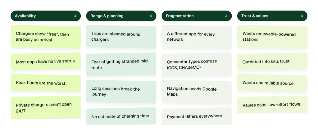
I wrote every finding from desk research, app reviews and the persona on a note, then grouped them by theme. To be honest, this round had no user interviews.
The insights
- People don’t need more pins, they need to know which charger is free now
- Every trip is planned backwards from the next charger
- One wrong “available” undoes ten right ones
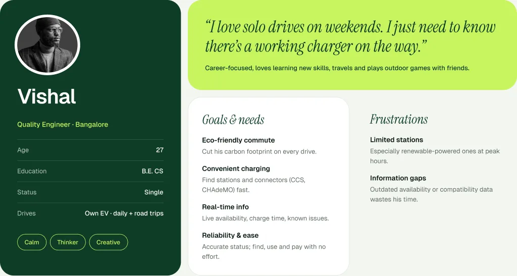
04 · Who I designed for
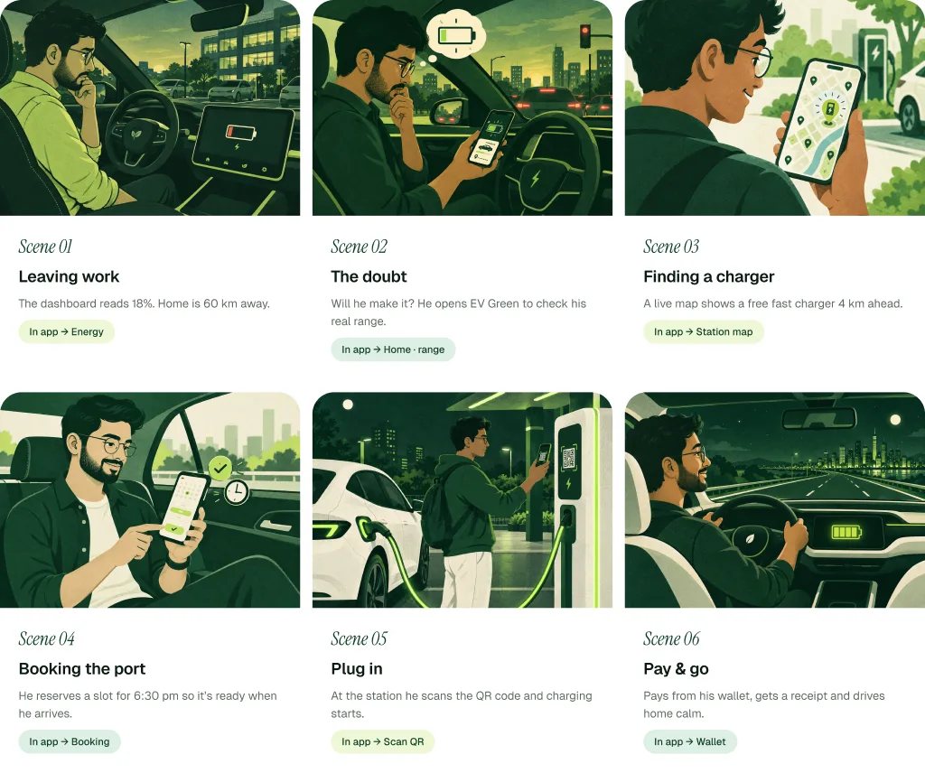
- Leaving work
- What he needs: Know his real range at 18%
- Where the app helps: Home: battery and range
- Finding a charger
- What he needs: A free charger on the way
- Where the app helps: Live station map
- Booking
- What he needs: The port ready when he arrives
- Where the app helps: Pre-book a slot
- Plugging in
- What he needs: Start charging without fuss
- Where the app helps: Scan the QR code
- Paying
- What he needs: Pay and drive home calm
- Where the app helps: Wallet and receipt
05 · What made the MVP
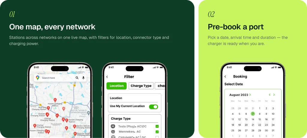
One map, every network
Problem: a different app for every network, and no live status.
Fix: stations from every network on one live map, with filters for connector type and charging power.
Pre-book a port
Problem: drivers arrive to find the charger busy or offline.
Fix: pick a date, arrival time and duration, so the charger is ready when you get there.
A wallet that’s built in
Problem: payment works differently at every station.
Fix: top up once and pay at any station, with UPI and cards saved in one place.
06 · Site map
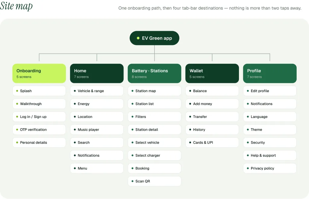
I mapped every screen before drawing any of them. After onboarding, everything sits under four tabs, and nothing is more than two taps away.
How it’s built
- Onboarding in five screens, from splash to personal details
- Battery and stations hold the map, filters, booking and QR scan
- Wallet keeps balance, top-ups, history and saved cards together
07 · Core user flow
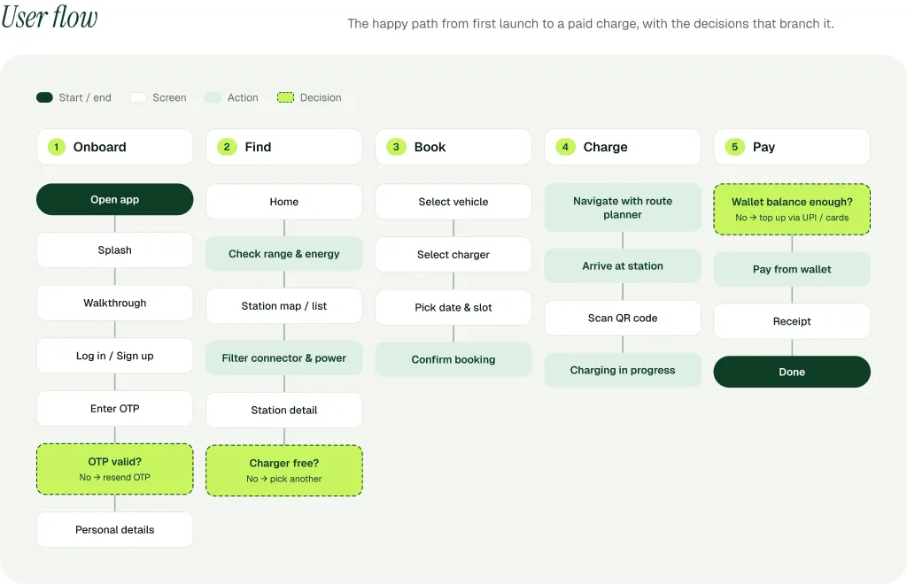
The user flow follows Vishal’s drive home: check range, find a free charger, book a port, scan the QR code to start, then pay from the wallet.
How it works
- Range comes first, because every trip is planned around it
- Booking happens before driving, so the port is ready on arrival
- Scanning a QR code starts the charge, no extra steps
08 · Onboarding
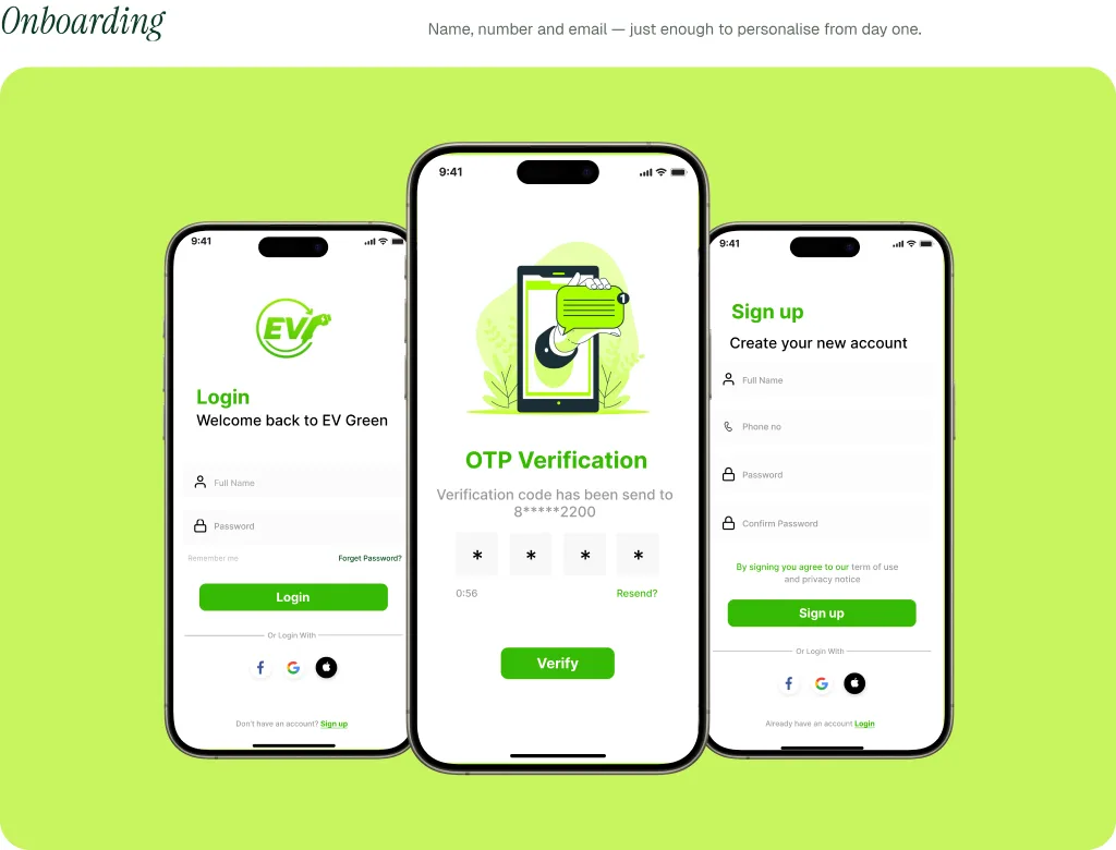
Three intro screens set expectations: find, charge, track. Then name, number and email, and the app is ready to use.
Why it works
- The walkthrough explains the app in three screens
- Sign-up asks only for name, number and email
- OTP verification keeps the account safe
09 · Design system
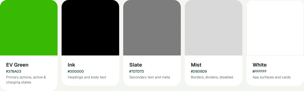
A single green carries every main action and charging state. The neutrals step back so maps, battery data and buttons read at a glance.
What’s in it
- EV Green #37BA03 for actions and charging states
- Inter for UI text, Gotham Pro for headings and numbers
- One line-icon family for charging, battery, wallet and search
10 · What it delivered
This round ran on desk research only. No interviews and no usability tests, and that’s exactly what V2 set out to fix.
- High-fidelity screens
- 26
- Paper sketches taken to hi-fi
- 12
- User interviews, honestly
- 0
11 · What I’d tell my past self
What worked. Benchmarking early showed the real gap, navigation plus reservation, and shaped the structure around the whole trip.
What I’d do differently. This round ran on desk research only. Next time, I’d test booking and route planning with real EV owners first.
Key takeaway. Range anxiety is an information problem. Live data people can trust matters more than more features.