
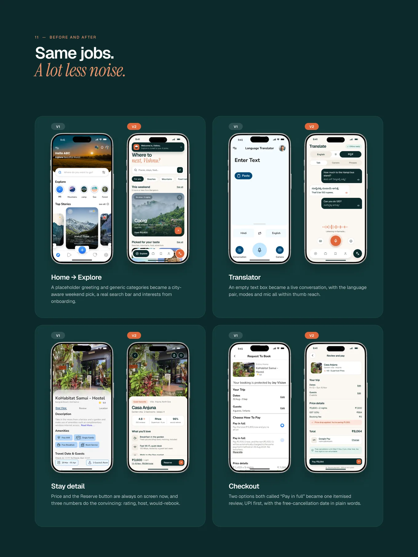
Most travel apps open checkout with a card form. In India, most people reach for UPI first. In Joy Vision V2 I flipped the order, and checkout went from 8 screens to 4.
- Checkout screens
- 8 → 4
- Shown first
- UPI
- Shown up front
- GST
01 · The problem
A wall of fields, then a surprise
V1 asked for a card number, expiry and CVV before anything else. GST showed up only on the last step. Someone who had already picked a stay hit a form they didn’t want, then a price they didn’t expect.
02 · Before and after
V1 next to V2
03 · What I’d test next
Does UPI on top actually make people faster?
In round two, five travellers will book a stay in Goa and pay with UPI. I’ll time it from review to paid, and watch whether anyone goes looking for the card option.